One sentence brief. One whole design system.
flockfysh wasn't a class project or a side experiment. It was a real startup, accepted into Z Fellows and taken to the final interview stage at Y Combinator. I was the only designer, brought in when the product was already being built but had no visual identity at all.
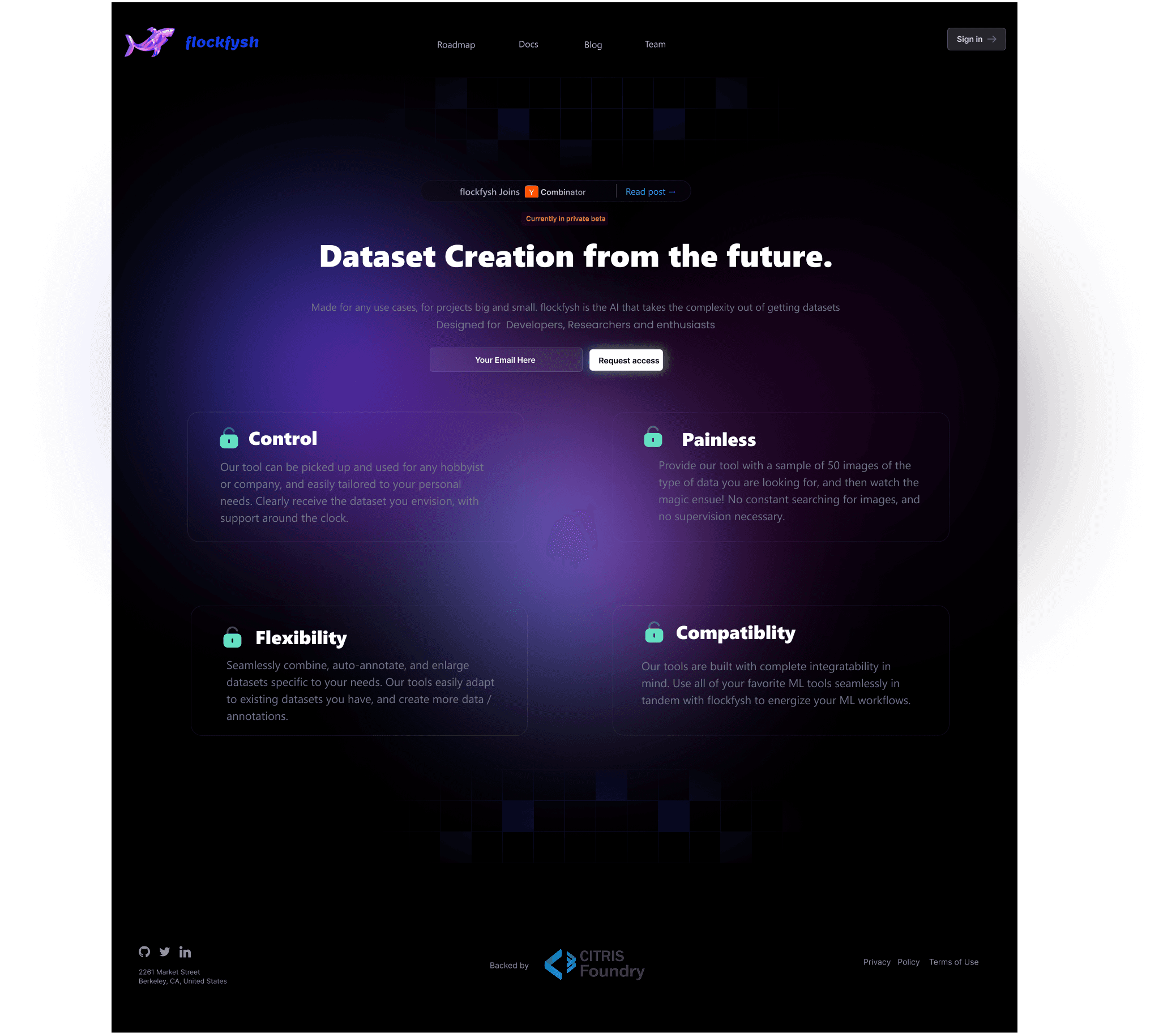
The first thing they handed me was a brief: we need a color palette. The name is "flockfysh", like a flock of fish. Think ocean.
That one sentence ended up shaping everything.
ML tools are ugly. I wanted to change that.
Before touching Figma, I needed to understand what we were actually building.
flockfysh automated the part of machine learning that nobody wants to do: data scientists spend roughly 80% of their time collecting, cleaning, and preparing data, and only 20% actually doing the analysis. flockfysh scraped data from multiple sources, cleaned it with AI, gave teams Git-like version control for datasets, and let them collaborate in one place.
The users were ML engineers, data scientists, and researchers. Technical people allergic to anything that feels designed for a marketing site. They want density, clarity, and tools that respect their intelligence. That shaped every decision I made.
Visual Evidence
Image

Ocean at night, not a travel brochure
The ocean brief was a starting point, not a constraint. I didn't want to make something that looked like a travel app. I wanted depth, the feeling of looking into water at night.
I built three primary color ramps, each a different reading of blue. #04033E is the base, almost black with just enough blue to feel like the ocean floor rather than a void. This became the foundation for dark surfaces. #08066C is deep navy, used for text and secondary surfaces where the base was too dark. #010BFF is electric blue, pure and vivid, almost bioluminescent. That became the accent: interactive elements, calls to action, highlights.
Each ramp had a full 10-step scale from 950 to 100, giving the engineering team enough range to cover every state: default, hover, active, disabled, focus. The lightest values (#d2e1ff, #e7ebff) worked for backgrounds and subtle fills without losing the blue character.
The note in the file said "Colors may vary according to the product." I built the system flexible enough that the exact application could shift without the language breaking.
Visual Evidence
Image

One typeface. No debate.
Inter, throughout. Inter is built for screens, reads cleanly at small sizes, and has a natural monospace companion for data contexts.
The type scale was systematic: Display at 64px for hero moments, H1 at 40px in both bold and light, then H2 at 32px and H3 at 24px continuing down with bold and light variants at each level. Having explicit light variants at every heading level was a deliberate call. In a data-dense product, light-weight type lets you create hierarchy without adding more color or size contrast. A bold label next to a light value is instantly readable, no extra styling needed.
How I actually worked
I shared designs in progress rather than big reveal presentations, sat in on standups, and iterated fast based on what I heard.
I started by studying what existed: Scale AI, Labelbox, Roboflow, Weights and Biases. Most ML tools either look like raw infrastructure or like they were designed to impress at a demo day and fell apart inside. I wanted flockfysh to feel like it was built by people who actually used these tools every day.
Before any color, I roughed out the core flows in lo-fi wireframes. The dataset upload experience, the annotation interface, the dashboard, the collaboration workspace. Lo-fi meant the team could give feedback on structure without getting distracted by polish. We went through several rounds.
Once the structure was settled, I built high-fidelity screens using the components I was building in parallel. The deep blue palette came alive on dark surfaces. The electric #010BFF on a near-black #04033E background has real luminosity, it reads immediately without needing to be large.
When something wasn't buildable in the timeline, I redesigned rather than pushed back. A design that can't be shipped isn't a design.
Visual Evidence
Image

Every screen, explained
The navigation system has two states: expanded with labels, collapsed to icons only. Not just a responsive pattern, it's about giving power users more canvas. Someone annotating datasets all day doesn't need to read "Datasets" every time they click it.
Dataset cards surface image count, time since update, a description, and type tags. The hover state shifts the card background to Primary 2 (#08066C), a subtle but clear affordance. The dark palette meant selection states needed to work with light rather than darkness, so I used the lighter end of the blue ramp for active states.
The "New Dataset" modal is one of the most-used flows. Deep blue background, drag-and-drop upload zone with a dashed border, Recipe selector, Dataset type and Tags fields in a two-column layout, and a full-width Create button. At the bottom: real-time upload progress and confirmation. Status communication was important here because uploads could take time and users needed to know what was happening.
The annotation interface was the hardest screen to get right. Too much information competing for attention. The solution was strict panel separation: Recipe (what you're looking for) on the left, Data (what you're looking at) on the right, Annotations (what you've marked) at the bottom. Three distinct jobs, three distinct zones.
Visual Evidence
Image

Designing without a safety net
Being the only designer in a fast-moving startup is a different kind of pressure than working in a design team. There's no one to review your work before it ships. You make calls quickly, communicate them to engineers, and stay willing to be wrong and iterate.
The YC interview process pushed us to articulate what the product actually was in very few words, and that pressure made me think harder about what the design was communicating. Every screen is a pitch. Every interaction is an argument for why this tool is worth the switch.
flockfysh didn't reach the scale we hoped for. Enterprise B2B sales cycles are long and product-market fit is hard. But the design work was the most end-to-end thing I'd done: from a one-sentence brief about ocean colors, to a complete system that engineers shipped from every day.