Question
What was the hard part?
A fan archive needed structure without losing the feeling of fandom.
Project dossier / Design + Engineering
A mini-encyclopedia for BTS fans: songs, member profiles, discography data, concerts, and awards all in one place.
Evidence board
A fan-native archive where data modeling, color systems, and discovery tools make a decade of music feel navigable.
Question
A fan archive needed structure without losing the feeling of fandom.
System
TypeScript / CSS / Next.js / React
Evidence
Member-color spotlights make the landing feel fan-native instead of generic
Decision
No official BTS API exists.
Artifacts linked above

I've been a BTS fan for a long time. The music, the solo work, the things they do outside of music. And the more I explored, the more frustrated I got with how scattered everything was. Wikipedia is shallow. Streaming platforms only surface what's charting now. Fan wikis are exhaustive but chaotic. Nothing felt designed.
I wanted a single place that treated BTS's decade of work the way it deserved: organized, searchable, beautiful, data-rich. So I built it.
BTS concerts are defined by one image: stadiums filled with purple ARMY bombs, a sea of light. The landing page is built around that. A dark full-screen field of purple and pink particle bokeh, with seven colored spotlight beams rising from a stage line. One per member, each in their official signature color. For ARMY, the colors are immediately recognizable. For a new listener, it's a first signal that this wasn't thrown together.
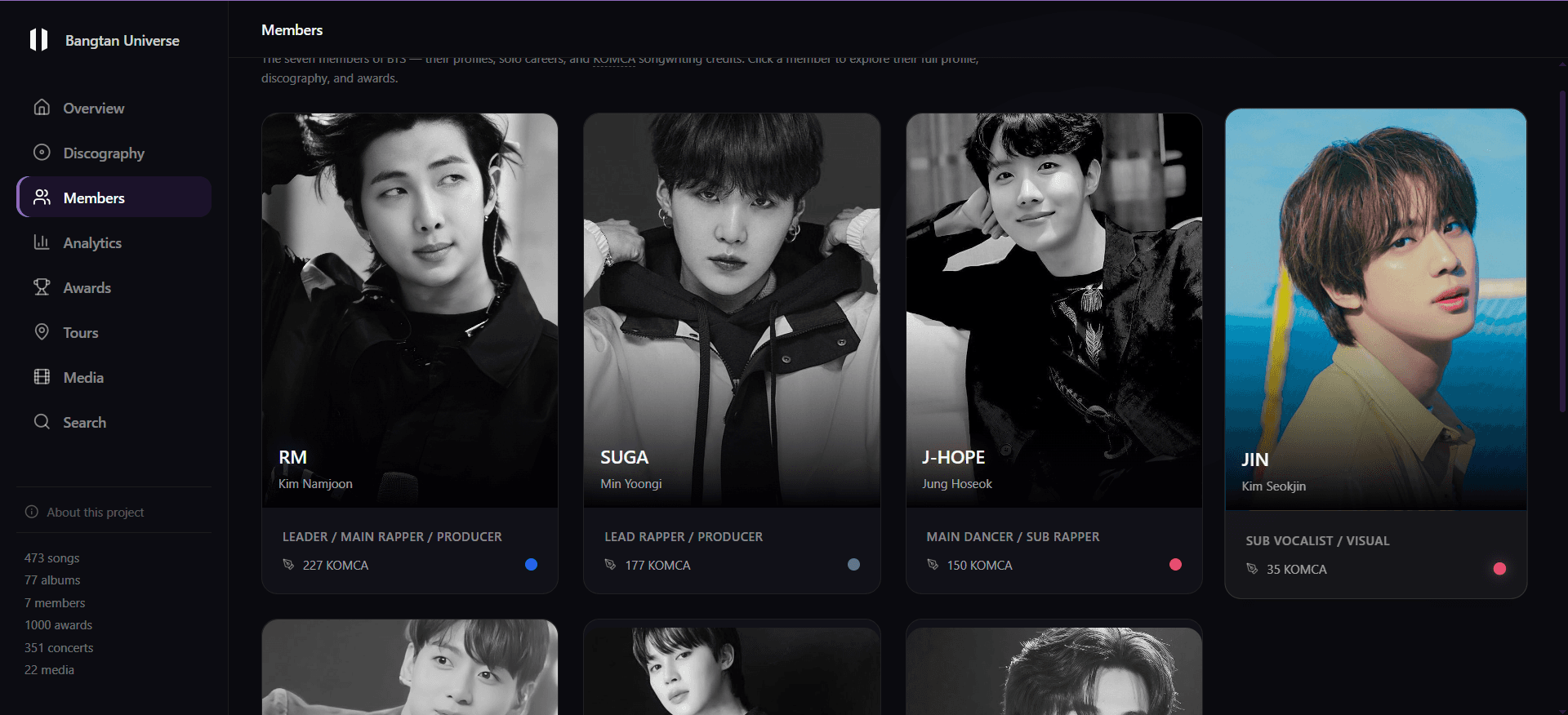
That color system runs through the entire site. Every member has a signature color, stored in the database as mic_color, that becomes the accent on their profile page, their bar in the analytics charts, their dot on the member grid. Seven distinct visual identities, one consistent system.
Visual Evidence
Image
The top-level sections (Discography, Members, Analytics, Awards, Tours, Media, Search) aren't arbitrary. Each one represents a distinct mental model for how someone navigates a music catalog.
Some fans organize their knowledge by member. They want to know everything RM has made, from BTS tracks to mixtapes to solo albums, in one place. The Members section is built for that. Some fans think in eras: they want to see everything from the HYYH period, across albums and concerts and documentaries. Some fans come to discover or rediscover the music itself, filtering by mood or audio quality. The IA has to accommodate all of these without making any one of them feel like an afterthought.
Design Decision
Using fan-native vocabulary in the navigation makes the IA immediately legible to the target audience without any explanation.
The era classification system was one of the most deliberate decisions in the whole project. I could have classified albums by release year, or by chart performance, or by production team. I didn't, because none of those map to how ARMY actually talks about the music. BTS's eras (HYYH, Wings, Love Yourself, Map of the Soul) are defined by thematic and artistic shifts, and those are the categories fans already use in every conversation about the discography. If you're an ARMY and you see "HYYH era" as a filter, you know exactly what that means.
The member profile page structure follows a specific order: personal context first, then artistic output. Bio and background come before solo discography, which comes before group contributions, which comes before production credits. A profile page that led with a discography table would feel like a Wikipedia entry. One that leads with a bio reads like a proper profile.
One deliberate choice: global chart positions and streaming numbers are not primary content anywhere on the site. Those metrics answer one question (how commercially successful was this) and it's not the most interesting question. I wanted the site to surface what the music actually is, its audio characteristics, its lyrical themes, its place in BTS's artistic arc, rather than how it performed on Billboard.
This is where most of the work actually happened. The site is backed by a Supabase database with 12 relational tables covering everything BTS has ever made or done.
The songs table is the core. Each row stores not just title and album, but BPM, energy, valence, danceability, acousticness, sentiment classification, writers, producers, member credits, lyrics in Korean/English/Romanized, music video URL, and whether it's a solo, collab, or group track. The five audio features were curated by hand from public sources (Spotify, SongBPM, Tunebat, Wikipedia) rather than pulled live from an API, so the schema stays honest about songs whose numbers I couldn't verify. Lyrics came from the Genius API and discography from MusicBrainz, cleaned and reconciled across different romanization standards.
The members table is similarly detailed: bio, birth info, height, MBTI, education, enlistment and discharge dates, solo debut date, KOMCA credits, producer credits, writer credits, achievements, featured tracks. Everything needed to build a proper profile page without hitting an external API at render time.
Getting all of this into a consistent schema required significant scraping and cleaning work. Fan data sources use different romanizations, different album version naming conventions, missing fields for older releases. The cleaning process was longer than the UI work.
Data pipeline
Genius API
Lyrics
KR / EN / Romanized, reconciled
MusicBrainz · Setlist.fm
Discography + setlists
Albums, releases, concert setlists
Supabase · 12 tables
Relational catalogue
songs · albums · members · solo_albums · lyrics · awards · chart_entries · concerts · collaborations · member_events · media
Recharts scatter
Mood Quadrant
energy × valence, one dot per song
Fuse.js + cosine
Fuzzy search + similar songs
5-feature cosine vector, text fallback when audio is sparse
Side By Side
Compare
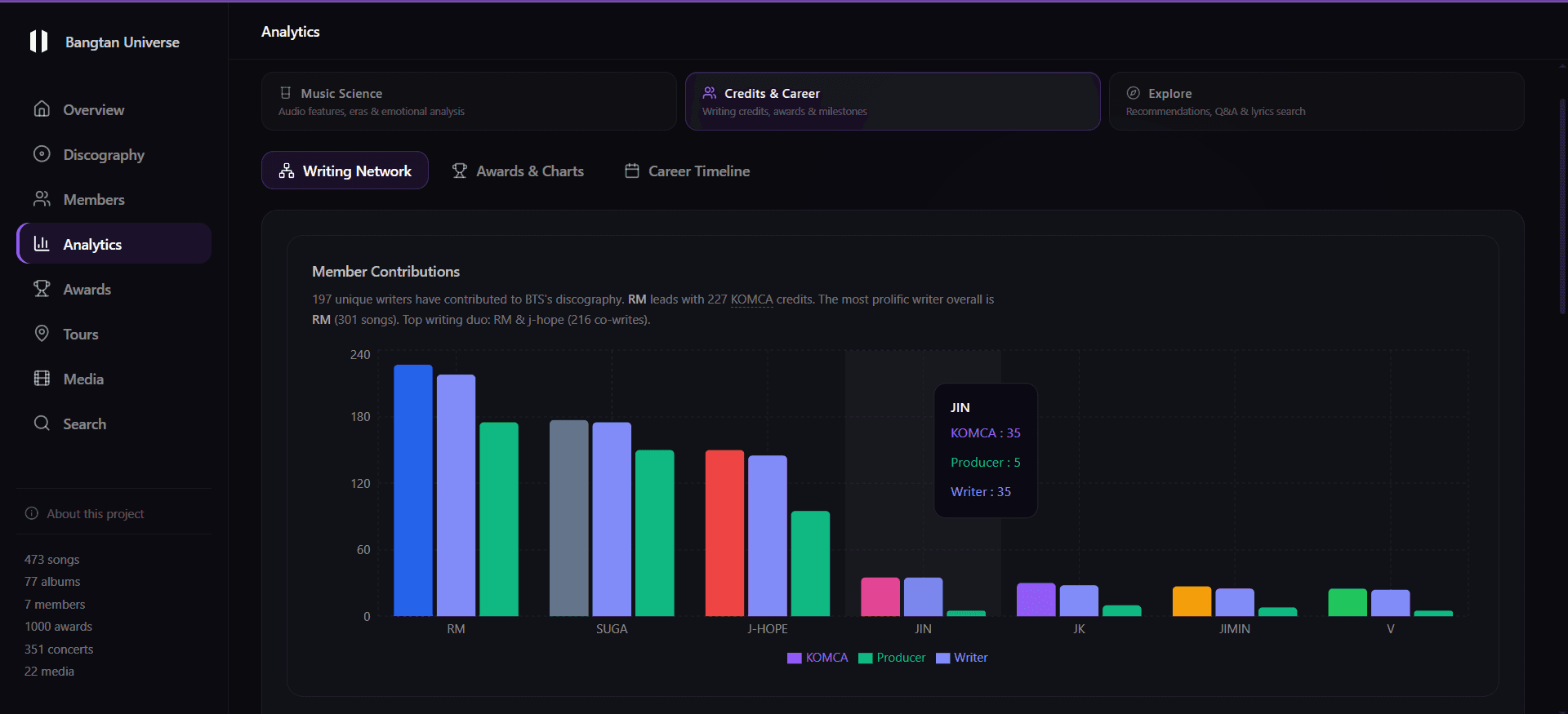
The overview dashboard shows the scope immediately: 473 songs across 10 eras, 77 albums, 631 awards won, 351 concerts across 29 countries with more than 37 million total attendance. Each number is a live query, not a hardcoded stat.
The Analytics section is where the audio data gets interesting. A Mood Quadrant plots songs on energy vs. valence axes, colored by era, so you can see how BTS's emotional center of gravity has shifted over time. I colored the dots by era rather than by member because the interesting story is about sound over time: HYYH clustering in one quadrant, Map of the Soul in another.
Mood Quadrant · energy × valence
The Search page runs Fuse.js fuzzy matching client-side (with an optional Supabase query path) and includes a mood-based discovery mode. Filter by Happy, Sad, Energetic, Calm, Romantic, or Motivational and get ranked song recommendations with live audio feature previews.
Multilingual content introduced a real typographic design problem. Korean, English, and Romanized Korean have different character shapes, different line-height requirements, and different conventions for "readable at body size." Korean Hangul is square-block script that needs more vertical breathing room than Latin characters. I settled on three stacked text blocks with clear label hierarchy (Korean first, Romanized below it in a slightly lighter weight, English translation last) with enough line-height in each block that the scripts don't feel compressed against each other.
The "similar songs" feature scores by audio feature proximity rather than collaborative filtering. That was partly a constraint (with 473 songs and no actual user play data, collaborative filtering has nothing to train on) and partly a design choice. Audio feature similarity is objective and already interesting. The result is that recommendations sometimes surface obscure deep cuts that share an energy profile with a more popular track. That's more useful than "other people who liked this also liked that," which usually just returns other popular songs.
It's still being built. But more than any other project I've worked on, this one exists purely because I wanted it to. No assignment, no brief, no client. Just someone who cared about the subject matter and had the skills to do it properly.
That combination is why the data model got as detailed as it did. I wasn't guessing at what information a fan would want. I knew.
What Worked
What Didn't
Built with