Question
What was the hard part?
Component libraries should not become black boxes after install.
Design + Engineering
A registry-first React design system that ships editable shadcn-compatible components with Figma-sourced tokens included.
Evidence board
A registry-first design system where tokens, component source, and install paths are designed as one product surface.
Question
Component libraries should not become black boxes after install.
System
React / Next.js / TypeScript / Radix UI
Evidence
Twelve primitives can be installed as editable source with the token layer included.
Decision
A shadcn-compatible registry forced tokens, utilities, dependencies, and file targets to ship together.
Artifacts linked above
Most component libraries solve the first week of a project beautifully. You install a package, import a button, and move fast. Then the real product starts pushing back.
The button needs one behavior the package does not expose. The input needs to match a Figma state that is not part of the theme API. The team wants the component to feel native to their app, but the code lives somewhere else, behind versioning, wrappers, overrides, and a mental model nobody fully owns.
Oceania started from that irritation. I wanted a design system where the install path did not separate teams from the code they were expected to use every day.
Design Decision
Installed UI should feel owned by the team that installs it.
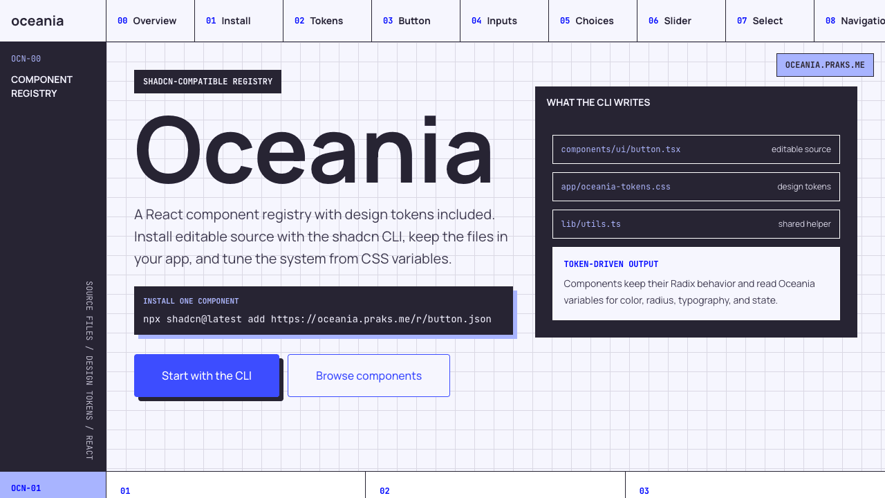
The core decision was to follow the shadcn model: components install as editable source, not as a sealed runtime dependency. Oceania hosts registry JSON files at oceania.praks.me/r/*.json. When someone runs the CLI command, the component file lands inside their app.
That changes the relationship between the design system and the product team. Oceania provides the starting point, the tokens, the dependency list, and the expected behavior. The consuming app keeps the final authority.
The workspace is split around that idea:
packages/ui holds the React source: Button, Input, Select, Tabs, Tooltip, and the other primitives. This is the code the registry eventually hands to the consuming app.
apps/registry is both docs site and distribution surface. It previews components, explains install commands, and publishes schema-valid shadcn registry files.
Visual Evidence
Image
A component copied without its tokens is only half portable. The button might render, but its color, radius, typography, disabled state, and focus ring are still floating somewhere else.
So Oceania treats tokens as a registry item too. The tokens.json entry writes app/oceania-tokens.css into the consuming app. Components reference those variables directly through Tailwind arbitrary values, which keeps the contract simple: install the component, import the token file, then tune the system from CSS variables.
The first set covers the pieces I reach for constantly: Button, Input, Textarea, Checkbox, Radio Group, Switch, Slider, Select, Tabs, Breadcrumb, Pagination, and Tooltip. Not flashy. Very deliberate. These are the controls where state, focus, spacing, and disabled behavior quietly decide whether an interface feels built or assembled.
I did not want Oceania to hand-roll interaction behavior for controls that already have mature primitives. Select, Checkbox, Radio Group, Switch, Slider, Tabs, and Tooltip lean on Radix where keyboard interaction and accessibility semantics matter.
That let the design work stay where it should: visual grammar, states, composition, and install ergonomics.
The Button preserves asChild composition through Radix Slot. Form controls share border grammar across default, hover, focus, error, and disabled states. Select mirrors Input so it feels like part of the same system instead of a dropdown imported from another planet.
At first, the registry app could have been a thin docs page. But the more I built, the more obvious it became that the registry itself was the product surface.
Visual Evidence
Image
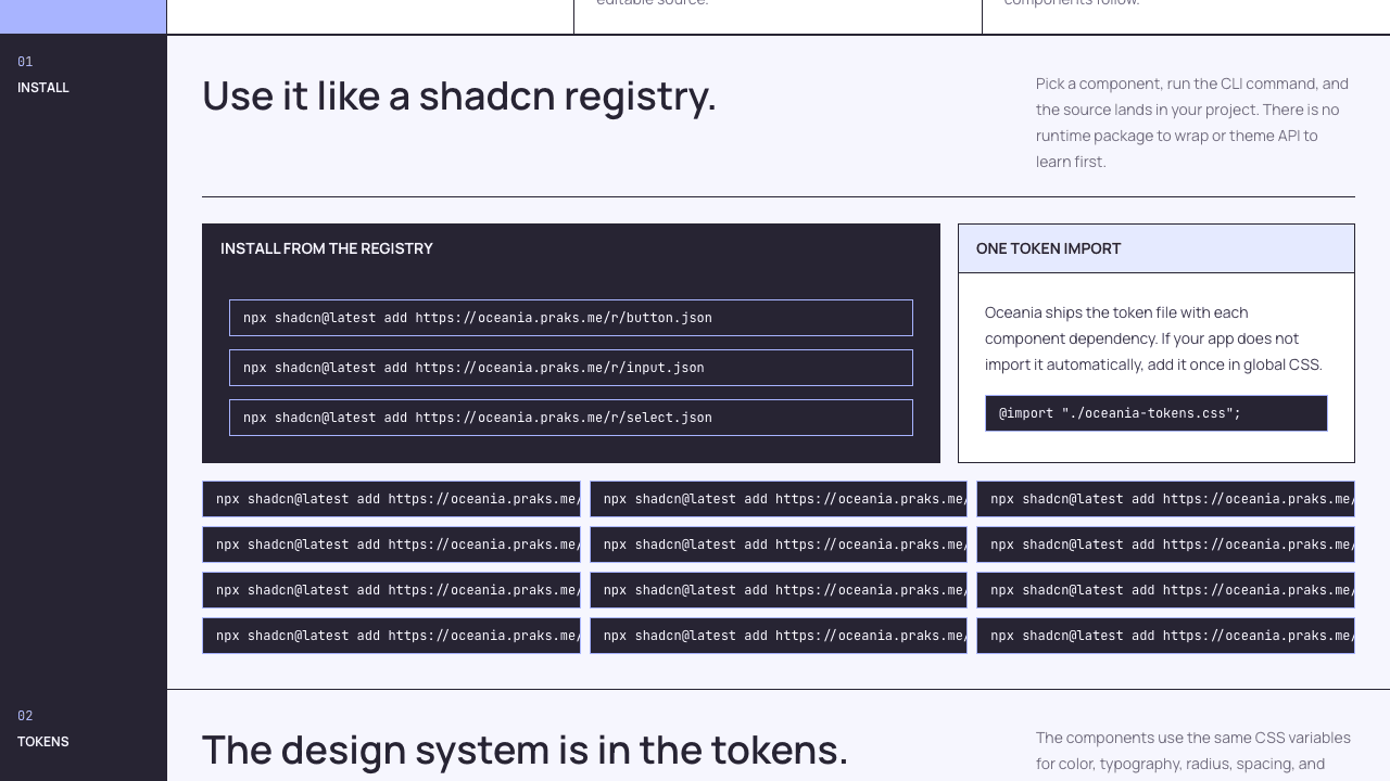
The build script generates each registry item from the component source. It injects dependencies, registry dependencies, docs notes, and target paths. That means button.json is not a hand-maintained artifact; it is the published shape of the component source.
The useful boring files matter here: fresh-install verification, browser QA notes, registry schema references, and a local pnpm verify gate. A design system can look polished and still fail at the moment someone tries to install it. Oceania treats that install moment as part of the design.
Oceania made me think about design systems less like component collections and more like delivery systems.
The visual layer matters, of course. The tokens need taste. The components need good spacing and state behavior. But the deeper question is operational: can another project actually receive this system without losing control?
For Oceania, the answer is registry-first. Ship the source. Ship the tokens. Make the generated files inspectable. Let the consuming app keep ownership.
That feels closer to how I want to build product UI: opinionated enough to create momentum, open enough that the people using it can keep going after the install finishes.
What Worked
What Didn't
Built with