On this page
The Intersection of UX and Machine Learning
What an AI answer needs around it so a student can check it, question it, or decide not to act on it.
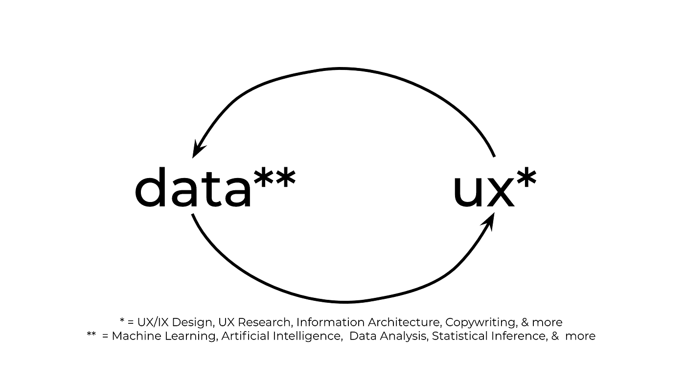
On SEAS Search, a plausible answer about a prerequisite could still be wrong. That made a design question hard to avoid: what should a student do after reading the answer?
I work across interfaces and machine learning, and that is where the two disciplines meet for me. The output needs enough context for someone to use it, question it, or decide not to act on it.
A result needs a way to check it
SEAS Search used course data and a knowledge graph to answer planning questions. Our graph-based evaluation reached 34% on multi-hop tasks. That is an experiment to learn from, not a reason to replace an advisor.
For this kind of interface, I would put the relevant course sources beside the answer, identify the semester the data covers, and distinguish a retrieved prerequisite from a recommendation. Questions about transfer credits or combined degree requirements need additional rules and review; they were not demonstrated by our course-graph experiment.
Those are design requirements I would test next. I do not have a user study showing that this presentation increases students' trust.
Uncertainty should change the next step
A confidence score is easy to display and hard to interpret. A value of 0.73 does not, by itself, tell a user whether an answer is correct. Its meaning depends on how the system was trained, evaluated, and calibrated.
The interface can provide more usable signals: which source supports a statement, what information is missing, and what needs checking before a decision. It should not turn an uncalibrated model score into a reassuring badge.
For a course lookup, that might mean linking the bulletin. For a scheduling decision, it might mean asking the student to confirm the current offering. The action depends on the risk of being wrong.
Design the stale-data state too
Course information changes between semesters. If the interface looks identical after an update, the user may not know why an answer changed.
I want the data's date to be visible where it matters, along with a clear response when a source is unavailable. The system should be able to say that it cannot verify something instead of filling the gap with fluent text.
That takes engineering support. Design cannot display freshness or provenance if the pipeline throws that information away.
Visibility is not a fix for bias
In projects involving geographic data, I want to know how coverage and errors vary by location, rather than looking only at an aggregate metric. Sparse rural observations can be a reason to investigate performance; they are not proof of a particular disparity without measurement.
Making a limitation visible helps people interpret an output. Addressing it may also require better data, a different model, or a narrower use case. A warning label cannot do that work on its own.
The handoff I care about
When reviewing an AI interface, I try to follow one answer through to the user's next decision. Can they see where it came from? Can they correct an input? What happens if the answer is wrong?
Those questions give designers and ML engineers something concrete to work on together. They also keep me from treating a polished answer as a finished product.
Read the SEAS Search experiment for the model work behind these questions.